
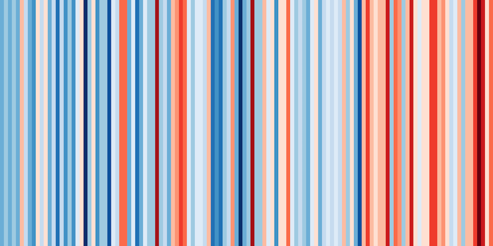
These ‘warming stripe’ graphics are visual representations of the change in temperature as measured in each country over the past 100+ years. Each stripe represents the temperature in that country averaged over a year. For most countries, the stripes start in the year 1901 and finish in 2018. For the UK, USA, Switzerland & Germany, the data starts in the late 19th century.
Earth just had its hottest June on record and is on track for the warmest July.